top of page


Here you will see that the building would be placed where it's open and not too crowded. I wanted it to be where you can see the green spaces.
Sketches
Before drawing what I wanted to design. I started off with making a diagram to see what places it could fit in. So here I thought why not make it in the open, since the closed spaces are mostly crowded.

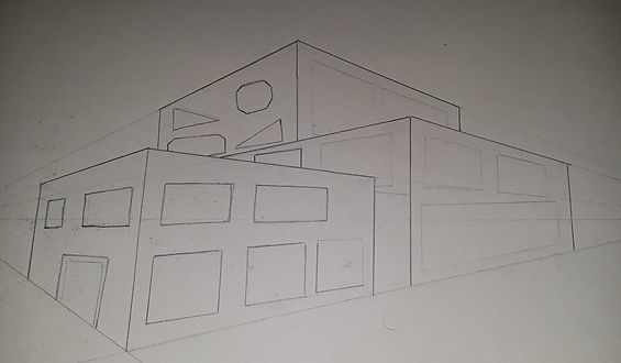
Once I have found a site that was more appealing. I then started with my sketch. for the building I wanted it to be in different height and width.

Avenir Light is a clean and stylish font favored by designers. It's easy on the eyes and a great go to font for titles, paragraphs & more.
bottom of page